Berkeleytime Course Card Redesign
Streamline design components to improve visaul and information consistency and data management.
Role
Product Researcher
Product Designer
Team
Kelly Ma, Michelle Tran
Timeline
Sept 2022 - Nov 2022
Methods
Product Research, Design System, Interaction Design
Context
Berkeleytime is a student-run, volunteer-based organization, entailing that our member turnover is frequent as students graduate. For the past years, we focused on bringing out new features and updating the website each semester, without establishing a design system.
Solution & Impact
We collaborated with front-end and back-end teams to redesign the course card component. Our solution not only kickstarted the establishment of Berkeleytime’s design system but also streamlined the meta-data of 11,000 courses offered at UC Berkeley.
Final Design Overview
Enhance usability by adding and carefully placing additional animation features.
Divide information with lines to improve readability and save space.
Correct Call-to-Action to guide students to the logical next step.
Identify & prioritize essential information to improve scannability.
Problem
“... why does this catalog course card* look super different from the cards on other pages??” (Kev, Berkeleytime PM)
Our designs are disgracefully inconsistent. My design team identified one of the most essential components—the course card—to increase visual and information coherence and kickstart a design system.
What is a Course Card?
Course card is a design system component of Berkeleytime that holds all metadata about an academic course—lectures, labs/discussions, instructor, location, enrollment rate, and grade. As shown below, course cards look different between pages throughout the website.
Course catalog course card
Course scheduler course card
Grade distribution course card
Unmoderated Usability Testing
After our PM Keving raised the issue of inconsistency, we conducted usability testing on 6 students to understand how they use and interact with our course cards.
The information on the course cards is simply indigestible. This increases the cognitive load of users and affects their ability to efficiently find the best course for their schedule and grade. This is, meanwhile, detrimental to the professionalism and trustworthiness of the Berkeleytime brand.
Redesign Guidelines
Identify & prioritize essential information to improve scannability.
Following usability testing, we discovered that students prioritize enrolling in classes with more open seats due to the stressful enrollment process. To ensure consistency across all UC Berkeley platforms, we revised the UX copy from "the number of students enrolled" to "the number of students enrolled vs the remaining open seats," aligning it with Berkeley's class catalog.
Our Redesign Efforts
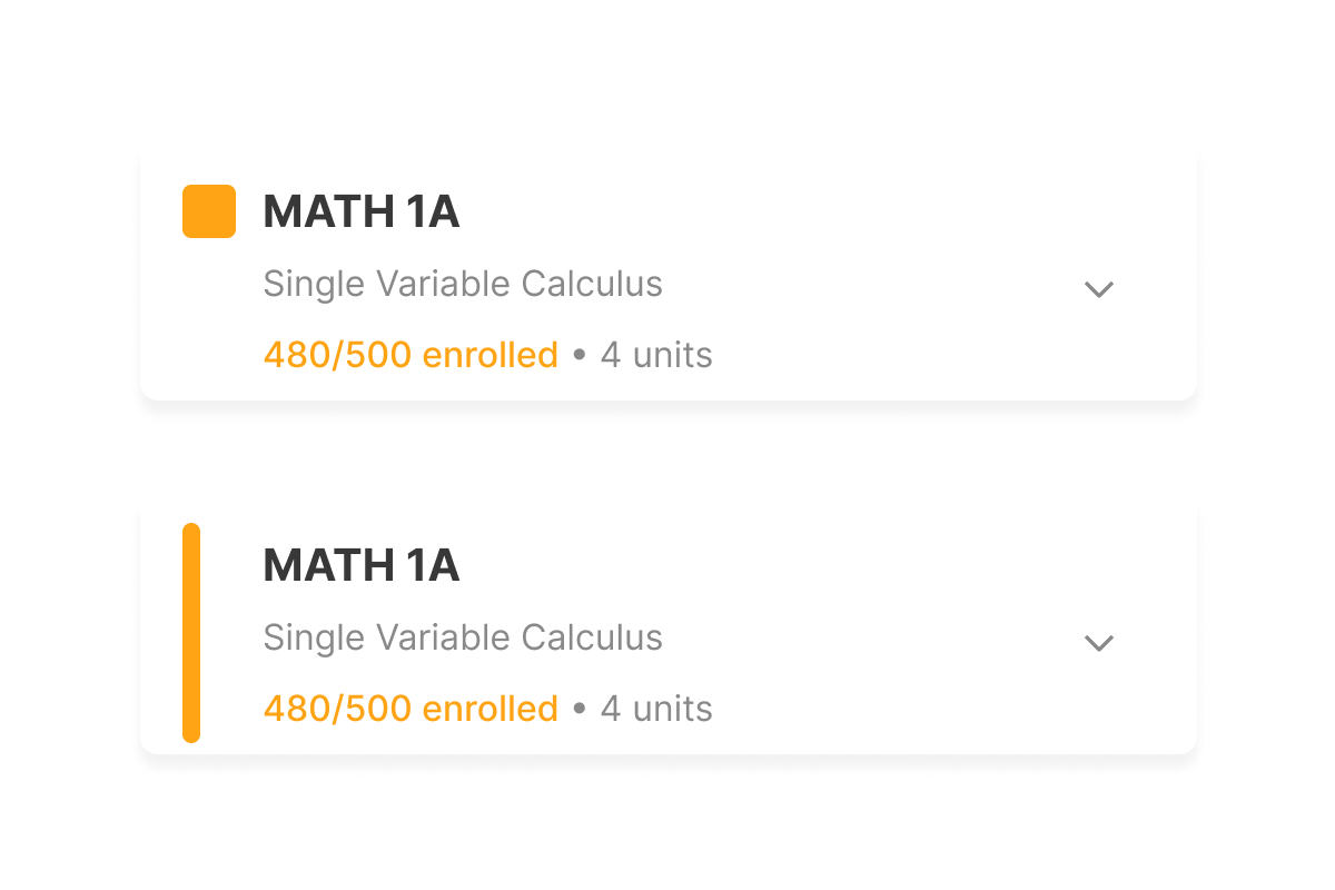
Divide information with lines to improve readability and save space.
Correct Call-to-Action to guide students to the logical next step.
To prevent confusion, we have replaced the checkbox item with a radio item to ensure that students can only enroll in one section. For special topics, multiple classes may be listed under the same name. In such cases, students are invited to use checkboxes to select these different classes.
▲ Berkeley’s Official Course Catalog
▲ Old Expanded Course Card
We grouped information by employing a border. By applying the Law of Similarity, we help students quickly connecting related information, thereby making the reading experience more intuitive. Additionally, the introduction of line separation replaced previous box designs, which occupied excessive visual space. This adjustment optimizes space and enhance the overall visual clarity.
▲ Special Topics
Ensure the consistency of course cards throughout the website.
▲ NEW! Course Catalog page
▲ Course Catalog page
▲ Grade Distribution page
While all Berkeleytime pages feature course cards, each page utilizes them in slightly different ways. To maintain consistency, we have designed the course cards to have a similar appearance throughout the entire site.
▲ NEW! Grade Distribution page
▲ Scheduler page
▲ NEW! Scheduler page
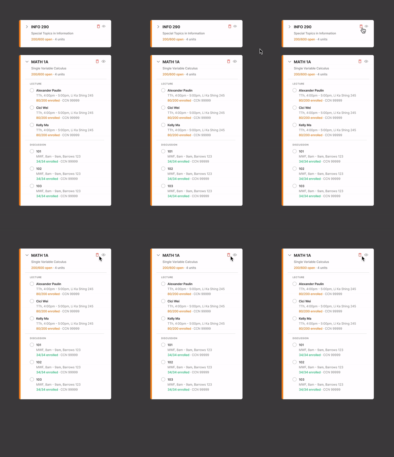
The "show and hide" icon is intentionally placed to the left of the "delete" icon to mitigate the risk of unwantedly deleting the course card.
Collapse & Hide
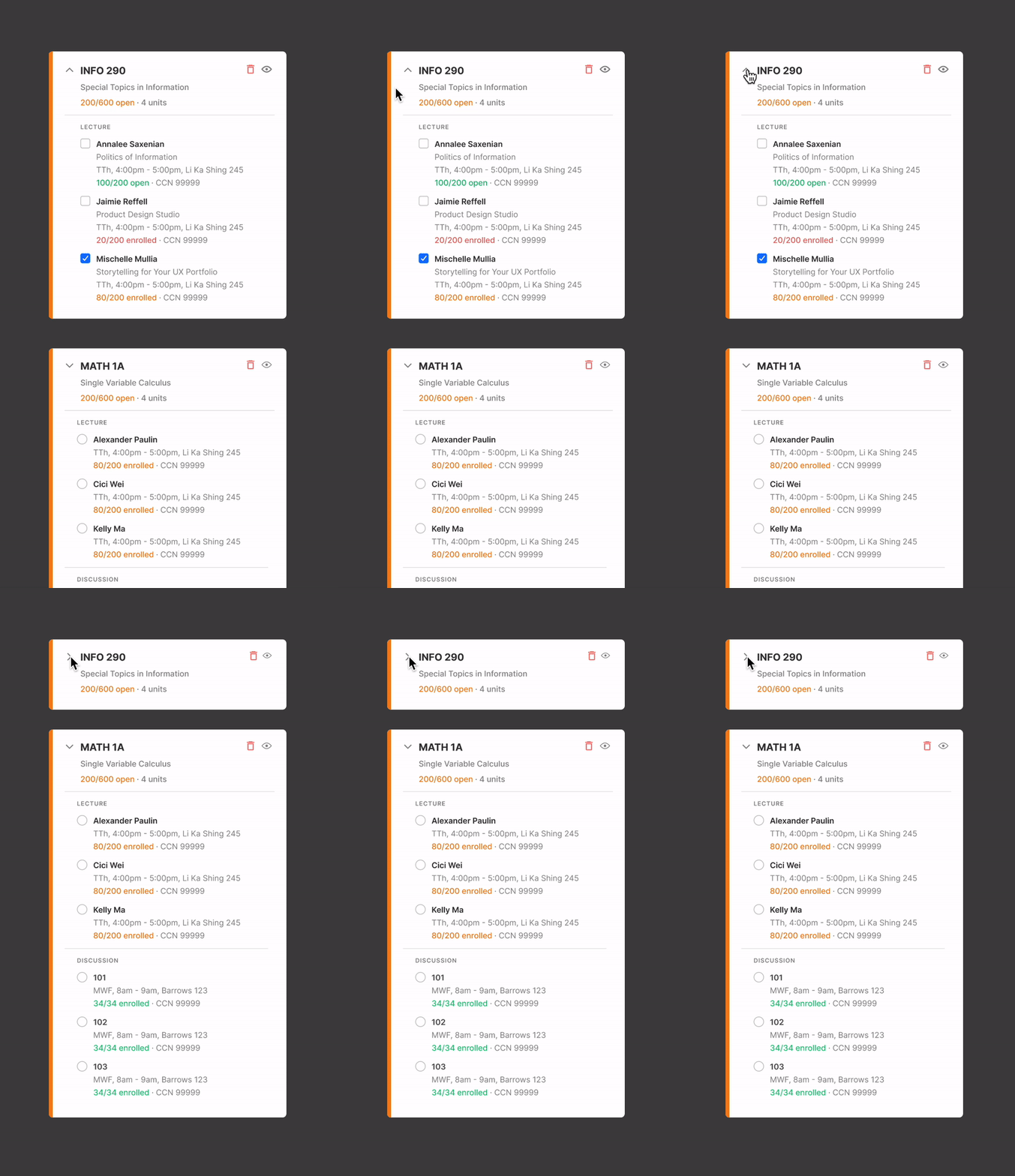
The enables students to conceal details, minimizing visual clutter without permanently removing any information.
Show & Hide
Delete
To prevent accidental deletes, the delete icon also is only visible on hover. (For demo purposes, I left it within the card)
Enhance usability by adding and carefully placing additional animation.
Final Version
Reflection
If we had more time…
Personal Growth
Web accessibility in the design system
Following this project, we conducted an accessibility audit on the site and discovered that our colors did not meet WCAG standards. Consequently, we have updated our core colors to ensure compliance. However, we wish to draw more emphasis on accessibility next semester.
Design Systems!!!
Initially, I felt a mix of excitement and concern about my ability to contribute effectively. Yet, after successfully completing this project, I have developed a genuine appreciation for design systems. The importance of establishing a robust design system has become clear to me, recognizing its critical role in ensuring the longevity of the product.
It is my privilege to contribute to an established design system as a student. While many of my projects typically involve creating something from scratch, Berkeleytime has provided my first exposure to participating in a high-impact initiative.
A heartfelt thank you to Kelly and Michelle from the Berkeleytime design team for their unwavering dedication and support throughout the project! It's truly my pleasure to be part of this entirely student-run organization that aspires to make a positive impact in our community.


