Berkeleytime Landing Page Reimagine
User Interface Design | Graphic Design | Brand Design
00 Overview
Berkeleytime’s landing page has not changed since a group of dedicated full-stack engineers first launched the product in 2018. Today, Berkeleytime is known to almost every UC Berkeley student as Berkeley’s most user-friendly academic tool. With a fast-growing user base, we recognized the need to offer the main entry point—the landing page—a fresh look to align with its social identity. Thus, we redesigned the landing page in hopes of increasing brand awareness as well as effectively introducing Berkeleytime’s feature to new users.
01 Design Audit
(1) Landing page lacks brand identity.
(2) The Call-to-Action button and graphics do not inform users about new Berkeleytime features.
(3) The feature section also does not introduce new Berkeleytime features.
(4) Inconsistent feature icons may lead to frustration when browsing the website.
(5) Generic UX copy does not effectively convey how Berkeleytime can help students.
(6) Alternating between different alignments increases the user’s cognitive load.
(6) Outdated Berkeleytime team photo.
02 Redesign Guidelines
03 Iteration
A more straighforward feature introduction
Accentuate Berkelytime’s branding through color, layout, and graphics.
Emphasize the recognizable Berkeleytime color and integrate a less static section break
List of features on the side
Translate the literal Berkeley“time” into a clock that ticks overtime
Demonstrate the passing of “time” with the changing shadow of the iconic campanile
Experiment layouts to introduce Berkeleytime’s feature
Side menu with description
Carousel with call-to-action button
Navigation bar with call-to-action button
With a simple, condensed welcoming banner
Group our explorations into the landing page with a logical order of welcoming banner, feature section, and additional internal information section
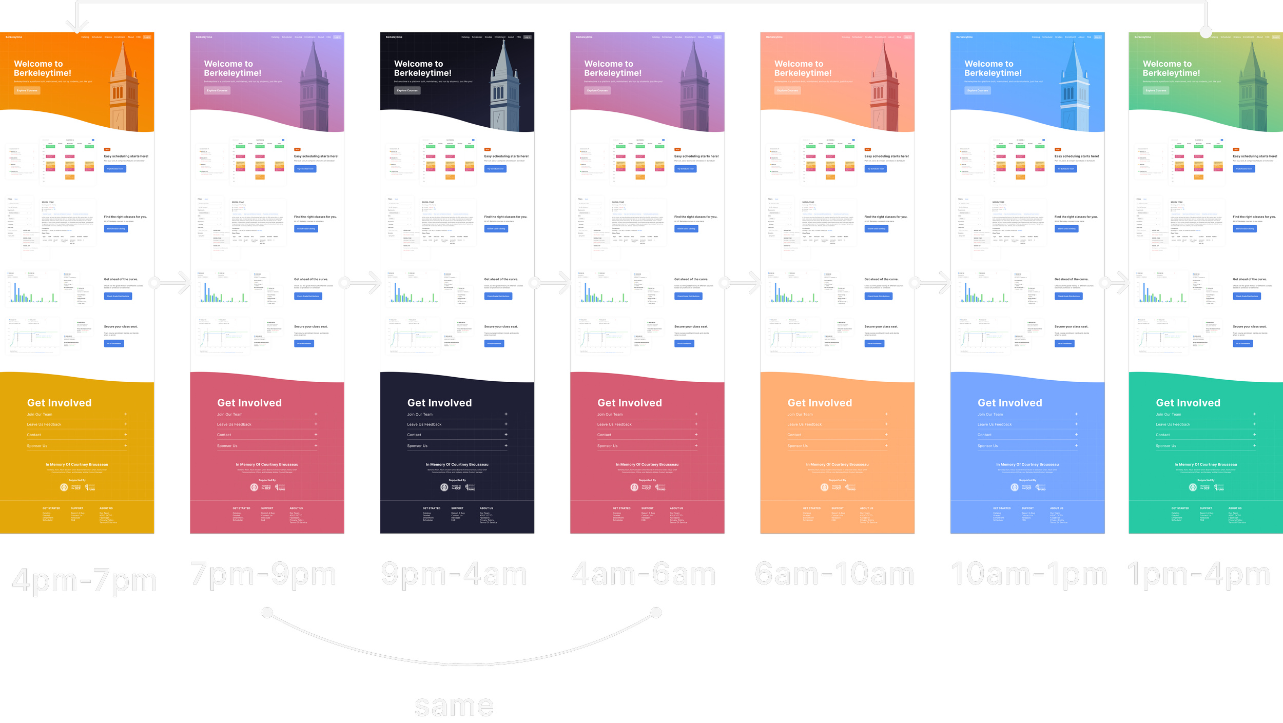
Inspired by our previous layouts, we created a more playful experience by implementing dynamic scroll where features show up one by one as users scroll through the landing page. In the internal information section, we alternated the layout of each part to effectively organize information while making the browsing experience more delightful. To strengthen our brand, we integrated the iconic Berkeley hill and campanile into the background—which changes color throughout the day.
04 Final Version
We modified the colors by increasing values and lowering chroma to mimic similar effects of the sunlight. With Gestalt’s Law of Common Region in mind, we decided to restore the white background for the features section to reduce visual load, while squashing internal information into a menu. The clearly defined boundaries between sections also resolve our engineering constraints.
05 Reflection
If we had more time…
Go deeper into Berkeleytime’s branding
Given the projected timeline, we did not have enough time to build a complete, detailed branding guide. As a team, we believe that a more structural branding would be helpful for future design and marketing efforts. This has been added to the project lineup—stay tuned!
Personal Growth.
Collaborating with cross-functional teams
This is my first time working on a UI-heavy project with cross-functional teams with a majority of front-end and back-end engineers. I learned to effectively communicate my designs and acknowledge our technical limits to design the best solution possible with constraints. Reaching a middle ground was challenging, but I enjoyed approaching design from a very different perspective!


